

Behind the matrix: The making of LOKKEE STUDIOS
Dive into the digital realm of LOKKEE STUDIOS! Join me in unraveling the secrets behind our web development odyssey, from code to creativity. Uncover the tech-stack wizardry, the fascination of futuristic themes, and the pitfalls of crafting an accessible carousel and the magic of canvas animations. Curious about the matrix effect and ready to take the red pill? Let's explore the wonderland of LOKKEE STUDIOS.
I am often asked about my decision-making process, problem-solving techniques, and the journey behind a website I crafted. Fueled by these sort of requests along with a personal desire to document my experiences, this blog was an inevitable outcome.
So, what better way to kick off this blogging journey than by unravelling how it all started ― the genesis of LOKKEE STUDIOS. Join me as we dive into the rabbit hole that led to the creation of something unique.
Quick disclaimer: While I aim to also make these posts engaging to all, no matter how involved in the web development field they are, brace yourself for some technical details. Feel free to skim through and pick out what catches your interest.
First things first
LOKKEE STUDIOS' is not just a static entity, but dynamic, almost like a living organ that has undergone a remarkable transformation from its initial version to its current state. Much like a living being, it adapts and evolves alongside the studio's growth, showcasing our capabilities as a web development and design studio. Always pushing the boundaries.
The tech-stack unveiled
The most common question I get is what tech-stack powers LOKKEE STUDIOS, so let's get this out of the way first and outline the core building pieces of the project:
- Astro: The cornerstone, a framework ideal for a (mostly) static site like a portfolio, leveraging "partial island hydration" (the Astro team did a way better job at explaining this concept than I ever could), allowing sites to only ship minimal, necessary JavaScript and thus making them load blazingly-fast
- Sanity: The headless CMS, which powers all dynamic, frequently-changing data like project case studies, customer stories, and this very blog post
- React: Building interactive, highly-reusable atomic components, cleverly hydrated (the process of becoming interactive by downloading it's JavaScript) on demand using Astro
- Framer Motion: The go-to library for complex interactive animations in React components
- Tailwind CSS: Hands-down the best CSS library out there (I guess I don't have to mention that this entire post is opinionated), for its efficiency in co-locating markup and CSS, allowing quick style changes
The journey took an unexpected turn when I discovered Astro and Tailwind CSS during the initial portfolio development phase. Instantly sold by them, I decided to refactor the entire site, a decision which significantly improved not only my workflow speed and the overall quality of what I ship, but also just my general well-being as a developer, honestly. Have been using them ever since in my projects. Can highly recommend to give them a shot!
Picking a theme
In the careful process of theme selection, LOKKEE STUDIOS adheres to a clear vision embodied in our slogan: "Web Development and Design Studio from the Future". This vision isn't merely a tagline — it's a guiding principle reflected in every aspect of our website, from the dark, spacey color theme with neon accents to the modern Inter font.
As you navigate through the site, you'll encounter a captivating collection of holographic aesthetics, celestial expanses, and the iconic matrix grid — a visual view mirroring our modern, forward-thinking approach. Even the loading screen mimics a garage door opening, revealing the inner workings of our digital lab. These visuals are a deliberate narrative push, setting LOKKEE STUDIOS apart in the digital landscape and visually showcasing our next-level capabilities.
A story about staggering
The about section's typing heading is the perfect use-case for Framer Motion.
While recent advancements like the ViewTransitions API (which are also already part of Astro ) and scroll animations decrease the reliance on external JavaScript libraries, which I am a really big fan of, staggered animation remains one of these things which are not quite possible yet without some external help.
Framer Motion steps up with its stagger utilities , making the typing heading a more effortless task. Headings seamlessly cycle through a defined pool of possible titles and fade in and out, with intervals determined by their character count. The magic lies in splitting the headings into characters, which are then staggered and animated using Framer Motion for smooth enter and exit transitions.
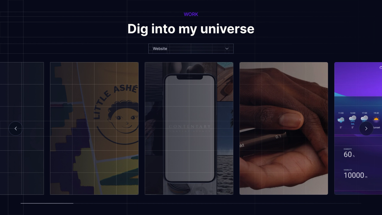
Project carousel: Navigating accessibility challenges
Did you ever have an idea so compelling it was worth putting in the extra hours? The carousel saga was one such journey.
Crafting an accessible carousel is no small feat, and hiding crucial content behind an action (which is obviously done in this case) goes against best practices, as most people don't bother to perform said action. Heat maps, colorizing intensities of website engagement, revealed minimal interaction with the carousel's hidden segments, which required user actions.
Upon completion, the carousel, though visually stunning and fully functional, who would have thought, fell short in accessibility. The quest for improvement led to intensive research, digging into articles on accessible carousels and yielding substantial enhancements.
Some smaller yet impactful improvements included keyboard navigation (i.e. arrow keys and tabbing), serving power users, and the addition of previous and next navigation buttons for those unable or unwilling to use swipe gestures.
The pitfall of shiny custom libraries, not staying native
The initial concept, utilizing Framer Motion's drag utilities , proved to be one of the biggest mistakes.
Turns out, using a custom library, not even designed for something as complex as carousels, introduces a myriad weird, hardly-debuggable issues. Just to give you an example: Tabbing through project slides caused the entire page to shift left, a consequence of Framer Motion's drag utilities altering the element's translate property, which updates only through dragging, not through tabbing. This made it so you could literally escape the entire website's content and end up with a blank page. Sounds like fun right?
Since this is propably hard to picture, here is a screenshot of how the carousel using Framer Motion looked when tabbing through:
The result was a misaligned carousel, solely reliant on JavaScript, rendering it nonfunctional in the event of failing to load the script, making the most crucial part of the portfolio website inaccessible to visitors. In pursuit of a solution, I opted for a different approach.
I found that setting the carousel wrapper to overflow-hidden and embracing relatively new CSS scroll properties like scroll-snap presented a comparable yet JavaScript-independent solution, where tabbing actually worked, as the browser natively scrolls to tabbed items.
All I had to do now is to enhance the native foundation by adding custom drag events, updating the scrollLeft value of the carousel.
Finally, everything looked and worked as expected:
Announcing changes to screen readers
A noteworthy accessibility win comes in the form of the aria-live attribute, a relatively recent HTML addition, which I discovered during research on carousel accessibility. This attribute vocalizes changes to text of the element it's on for screen readers, in my case, announcing the current project slide on navigation, an invaluable feature.
Nice to know: the copy button within this blog's code block also utilizes this feature to announce successful copying.
Set to "polite" it delivers non-urgent announcements, ensuring a seamless experience without demanding immediate attention. For time-sensitive notifications you would have to set it to "assertive".
project-carousel.tsx
<p
  role="status"
  aria-live="polite"
  aria-atomic="true"
  className="sr-only"
>
  Project {currentSlide + 1} of {projects.length}
</p>
"The red pill, please": Crafting the matrix effect
The starting point of the source code section conception was a (slightly modified) quote, paying homage to one of my favourite movies, "The Matrix":
"You take the blue pill - you keep scrolling, you leave this site and believe whatever you want to believe. You take the red pill - you stay in wonderland, and I show you how deep the rabbit hole goes."
To achieve the matrix effect, the initial plan involved animating each character as separate elements — a quite impractical approach due to performance concerns.
We would be talking about thousands of elements, even those out of the viewport, which would impact performance, for they would still exist in the DOM, making optimization challenging.
Achieving performant computed animations using canvas
This is where the <canvas> element comes into play, a sort of drawing board that allows you to performantly draw, edit and erase graphics on it.
Paired with a mask-image, to fade the design out towards its edges, it makes the matrix background possible.
With the canvas, draw calls can seamlessly run dozens of times per second, efficiently adding and updating the position and opacity of falling symbols. This ensures a smooth animation without the need for constant concern about performance issues.
A sneak peek into the future
If you've been paying close attention, you might have noticed the absence of the contact form section. I will unravel the intricacies of its backend, validation, and programmatically created confirmation emails — a tale for another time.
A quick reminder for those keen on exploring the website's source code further: it's completely open-source on GitHub , so feel free to dive in.
Back to blog posts